Friday, 3 August 2007

Colour psychology and use of colour in decoration

I am genuinely fascinated by colour - why we choose certain colours, what that says about us and how colour can influence our emotions.

Here's some stuff about colours and what is most suitable for different rooms when decorating.

Red
Associations: passion, love, danger, excitement, energy, warmth, adventure, optimism
Rooms most suited to: bedrooms due to the passion and warmth, dining rooms as it stimulates the appetite and promotes sociable and lively feelings.

Orange
Associations: Creativity, vitality and playfulness
Rooms most suited to: dining rooms as it stimulates the appetite, bedrooms - particularly if you struggle to get out of bed in the orning, study/office if you need to be creative and generate ideas


Rooms most suited to: kitchens, dining rooms or conservatories/sunny rooms


Rooms most suited to: bedrooms, living rooms


Pink
Associations: love and tenderness

Rooms most suited to: bedrooms - soft pastel pinks are especially peaceful and restful.


Green
Associations: nature, energy, calming, health, freshness, balance.

Rooms most suited to: bedrooms, living rooms, studies/offices


Blue
Associations: water, calm, coolness, keeps hunger at bay, authority, protection, power
Rooms most suited to: bedrooms, bathrooms, studies/offices


Brown
Associations: security, earth and nature, stability and practicality

Rooms most suited to: living rooms, hallways, utility areas


Black
Associations: elegance, style, rebellion.

Rooms most suited to: if used, it should be combined with something else


If you're interested in colour then there is some really interesting stuff on this site:

Heuga Virtual Room Tool

We have finally got our new Virtual Room Tool up and running on Heuga.com. We have spent ages working with a company to create this online tool where you can try out different floors in a room scene. It is really great and means you can get an idea of how a style looks before buying it.

We know people like to get creative with more than one colour or texture so we've included a combine option so you can add another style and see how the two look together.

If you fancy a play, here's the link: http://www.heuga.com/InterfRoomVisualiser/uk

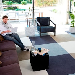
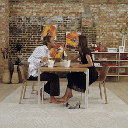
Here's some I created earlier...

Thursday, 2 August 2007

Essential Kitchen Bathroom Bedroom Magazine

I used to manage the PR for Heuga but now this is down to my colleague Antoinet. I still get the cuttings reports and was very pleased to see that we appeared in interiors magazine Essential Kitchens, Bathrooms and Bedrooms (August issue) and this is the shot they featured.

Love it or hate it - you can't help but be amazed by this floor design! This Zebra print floor is great for kids' bedrooms as well as other rooms in your home if you have the courage to do something different!

This photo was taken on a shoot for kids' bedrooms and I wanted to know whether this could work in a different room so we threw a few tiles down in the kitchen/dining room and this was the result. I think it works a treat and there's a magazine editor that agrees!

The red border is done using half tiles of Puzzle Pieces around the edge.

Heres a link to the magazine's website:
http://www.ekbb.co.uk/

Naming my Blog

Naming a blog is quite a challenge and in my search for inspiration I came across this post on the Business Week blog where these guys posted their brainstorm of a load of names...
http://www.businessweek.com/the_thread/blogspotting/archives/2005/04/how_to_name_a_b.html
I thought I'd do the same (despite working alone!) so I grabbed my Heuga scribbles pad and got a few names down. Here's some of the results:
I had a little help from a friend who suggested the smart 'Carpet Diem' - a play on the Latin phrase 'Carpe Diem' meaning 'Seize the day'. In my ignorance I had to check out the meaning and was very impressed. However I decided to keep it simple and Square-Vision was the winning choice.

Carpet tiles have a bit of an image problem but people are generally really impressed with the concept and design possibilities of carpet tiles once they've seen them in use so this blog is an attempt to share the delights of carpet tile design in the home.

My top 10 blog names: 1. Square Vision 2. Floor Space 3. Floor and More 4. Vibrant Square 5. Carpet Diem 6. Fair and Square 7. Inside Out 8. Floor Project 9. Square Living 10. Square Style

Wednesday, 1 August 2007

Cute and a little surreal!

This is a really great photo that was taken on a photo shoot in the Isle of Wight. The 3D Pebbles carpet and the close up of this cute little tot looks really fun! She was a real sweetie!

Heuga at 100% Design

This is a picture from the 100% Design Show in Rotterdam earlier this year.

My colleagues organised this and I thought they did a great job on the floor creating a rug effect out of 4 different styles, especially including the funky Pebbles design tile, which is a great product!

Heuga T-shirt

A friend suggested my photo doesn't look like me as I'm normally suited up in my work attire, however it is me and I'm wearing a Heuga t-shirt so I think it's kind of appropriate - it sticks until I can find something else.

I'm still new to this whole thing so reducing the size of the photo is still beyond my knowledge!

The red t-shirt was for a great interiors show called De Woonbeurs last year in Amsterdam where I organised a Heuga stand and we wore these Heuga t-shirts. It was a really great show and it was really fab for our team to meet directly with people and talk about our products.

I also added that I'm Online Marketing Manager at Heuga - that's what I do and I am always interested what people think of our website http://www.heuga.com/


I look at it a lot and see all the little problems so it is really nice when someone says it is a decent site however I am open to criticism too - I can take it and hopefully I can make improvements based on people's thoughts.